References (Viz)#
Visualisation#
Anova#
- class ANOVA(df)[source]#
DRAFT
Testing if 3(+) population means are all equal.
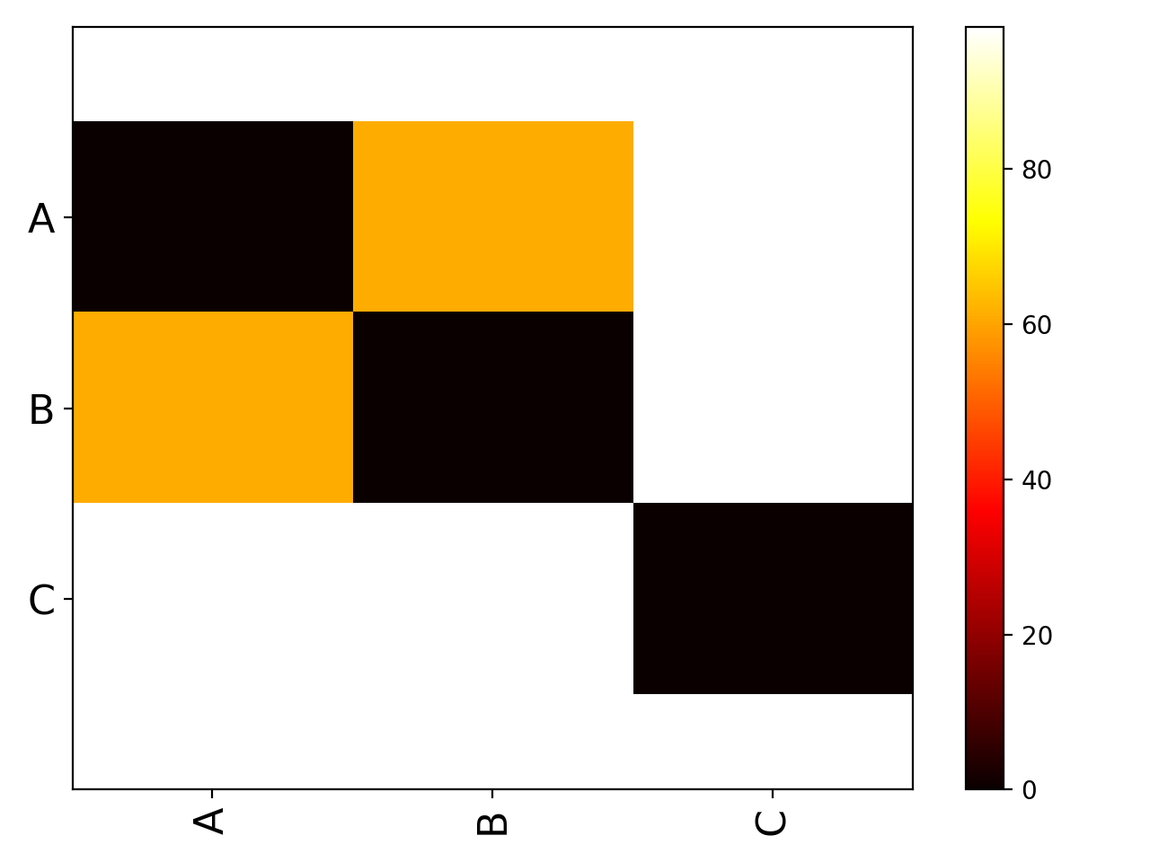
Looks like the group are different, visually, and naively.
from pylab import *
from sequana.viz import ANOVA
import pandas as pd

A = normal(0.5,size=10000)
B = normal(0.25, size=10000)
C = normal(0, 0.5,size=10000)
df = pd.DataFrame({"A":A, "B":B, "C":C})
a = ANOVA(df)
print(a.anova())
a.imshow_anova_pairs()
(
Source code,png,hires.png,pdf)
- anova()[source]#
Perform one-way ANOVA.
The one-way ANOVA tests the null hypothesis that two or more groups have the same population mean. The test is applied to samples from two or more groups. Since we ar using a dataframe, vector length are identical.
return: the F value (test itself), and its p-value
corrplot#
Corrplot utilities
- class Corrplot(data, na=0, compute_correlation=False)[source]#
An implementation of correlation plotting tools (corrplot)
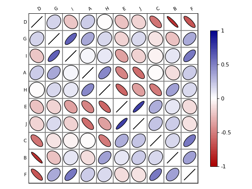
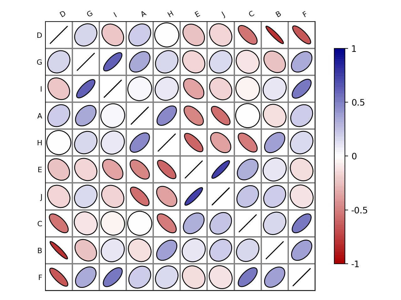
Here is a simple example with a correlation matrix as an input (stored in a pandas dataframe):
# create a correlation-like data set stored in a Pandas' dataframe.
import string
# letters = string.uppercase[0:10] # python2
letters = string.ascii_uppercase[0:10]
import pandas as pd
df = pd.DataFrame(dict(( (k, np.random.random(10)+ord(k)-65) for k in letters)))

# and use corrplot
from sequana.viz import corrplot
c = corrplot.Corrplot(df)
c.plot()
(
Source code,png,hires.png,pdf)
See also
All functionalities are covered in this notebook
Constructor
Plots the content of square matrix that contains correlation values.
- Parameters:
data -- input can be a dataframe (Pandas), or list of lists (python) or a numpy matrix. Note, however, that values must be between -1 and 1. If not, or if the matrix (or list of lists) is not squared, then correlation is computed. The data or computed correlation is stored in
dfattribute.compute_correlation (bool) -- if the matrix is non-squared or values are not bounded in -1,+1, correlation is computed. If you do not want that behaviour, set this parameter to False. (True by default).
na -- replace NA values with this value (default 0)
The
paramscontains some tunable parameters for the colorbar in theplot()method.# can be a list of lists, the correlation matrix is then a 2x2 matrix c = corrplot.Corrplot([[1,1], [2,4], [3,3], [4,4]])
- df#
The input data is stored in a dataframe and must therefore be compatible (list of lists, dictionary, matrices...)
- order(method='complete', metric='euclidean', inplace=False)[source]#
Rearrange the order of rows and columns after clustering
- Parameters:
method -- any scipy method (e.g., single, average, centroid, median, ward). See scipy.cluster.hierarchy.linkage
metric -- any scipy distance (euclidean, hamming, jaccard) See scipy.spatial.distance or scipy.cluster.hieararchy
inplace (bool) -- if set to True, the dataframe is replaced
You probably do not need to use that method. Use
plot()and the two parameters order_metric and order_method instead.
- plot(fig=None, grid=True, rotation=30, lower=None, upper=None, shrink=0.9, facecolor='white', colorbar=True, label_color='black', fontsize='small', edgecolor='black', method='ellipse', order_method='complete', order_metric='euclidean', cmap=None, ax=None, binarise_color=False)[source]#
plot the correlation matrix from the content of
df(dataframe)By default, the correlation is shown on the upper and lower triangle and is symmetric wrt to the diagonal. The symbols are ellipses. The symbols can be changed to e.g. rectangle. The symbols are shown on upper and lower sides but you could choose a symbol for the upper side and another for the lower side using the lower and upper parameters.
- Parameters:
fig -- Create a new figure by default. If an instance of an existing figure is provided, the corrplot is overlayed on the figure provided. Can also be the number of the figure.
grid -- add grid (Defaults to grey color). You can set it to False or a color.
rotation -- rotate labels on y-axis
lower -- if set to a valid method, plots the data on the lower left triangle
upper -- if set to a valid method, plots the data on the upper left triangle
shrink (float) -- maximum space used (in percent) by a symbol. If negative values are provided, the absolute value is taken. If greater than 1, the symbols wiill overlap.
facecolor -- color of the background (defaults to white).
colorbar -- add the colorbar (defaults to True).
label_color (str) -- (defaults to black).
fontsize -- size of the fonts defaults to 'small'.
method -- shape to be used in 'ellipse', 'square', 'rectangle', 'color', 'text', 'circle', 'number', 'pie'.
order_method -- see
order().order_metric -- see : meth:order.
cmap -- a valid cmap from matplotlib or colormap package (e.g., 'jet', or 'copper'). Default is red/white/blue colors.
ax -- a matplotlib axes.
The colorbar can be tuned with the parameters stored in
params.Here is an example. See notebook for other examples:
c = corrplot.Corrplot(dataframe)
c.plot(cmap=('Orange', 'white', 'green'))
c.plot(method='circle')
c.plot(colorbar=False, shrink=.8, upper='circle'  )
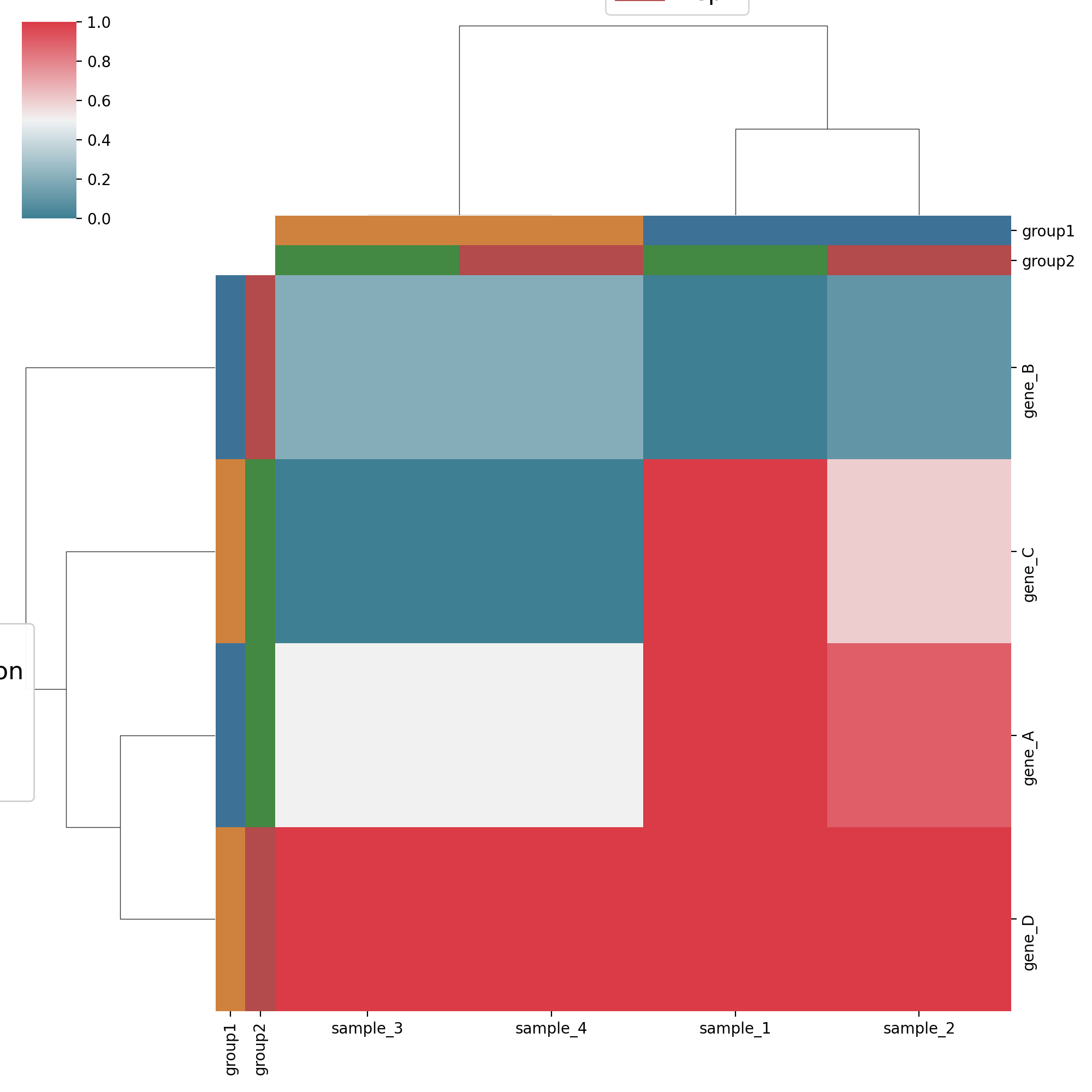
Heatmap, dendogram#
Heatmap and dendograms
- class Clustermap(data_df, sample_groups_df=None, sample_groups_sel=[], sample_groups_palette=None, gene_groups_df=None, gene_groups_sel=[], gene_groups_palette=None, yticklabels='auto', **kwargs)[source]#
Heatmap and dendrograms based on seaborn Clustermap
from sequana.viz.heatmap import Clustermap, get_clustermap_data
df, sample_groups_df, gene_groups_df = get_clustermap_data()
h = Clustermap(df, sample_groups_df=sample_groups_df, gene_groups_df=gene_groups_df)
h.plot()
(
Source code,png,hires.png,pdf)
Constructor
- Parameters:
data_df -- a dataframe.
sample_groups_df -- a dataframe with sample id as index (same as in data_df columns) and a group definition per column. Use to produce the x axis color groups.
sample_group_sel -- a list of the columns to select from the sample_groups_df.
sample_groups_palette -- the palette to use for sample color groups.
gene_groups_df -- a dataframe with gene id as index (same as in data_df columns) and a group definition per column. Use to produce the y axis color groups.
gene_group_sel -- a list of the columns to select from the gene_groups_df.
gene_groups_palette -- the palette to use for gene color groups.
ytickslabels -- "auto" for classical heatmap behaviour, [] for no ticks or a pandas Series giving the mapping between the index (gene names in data_df) and the gene names to be used for the heatmap
kwargs -- All other kwargs are passed to seaborn.Clustermap.
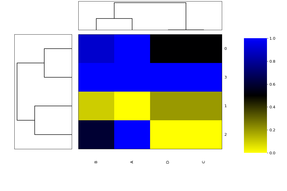
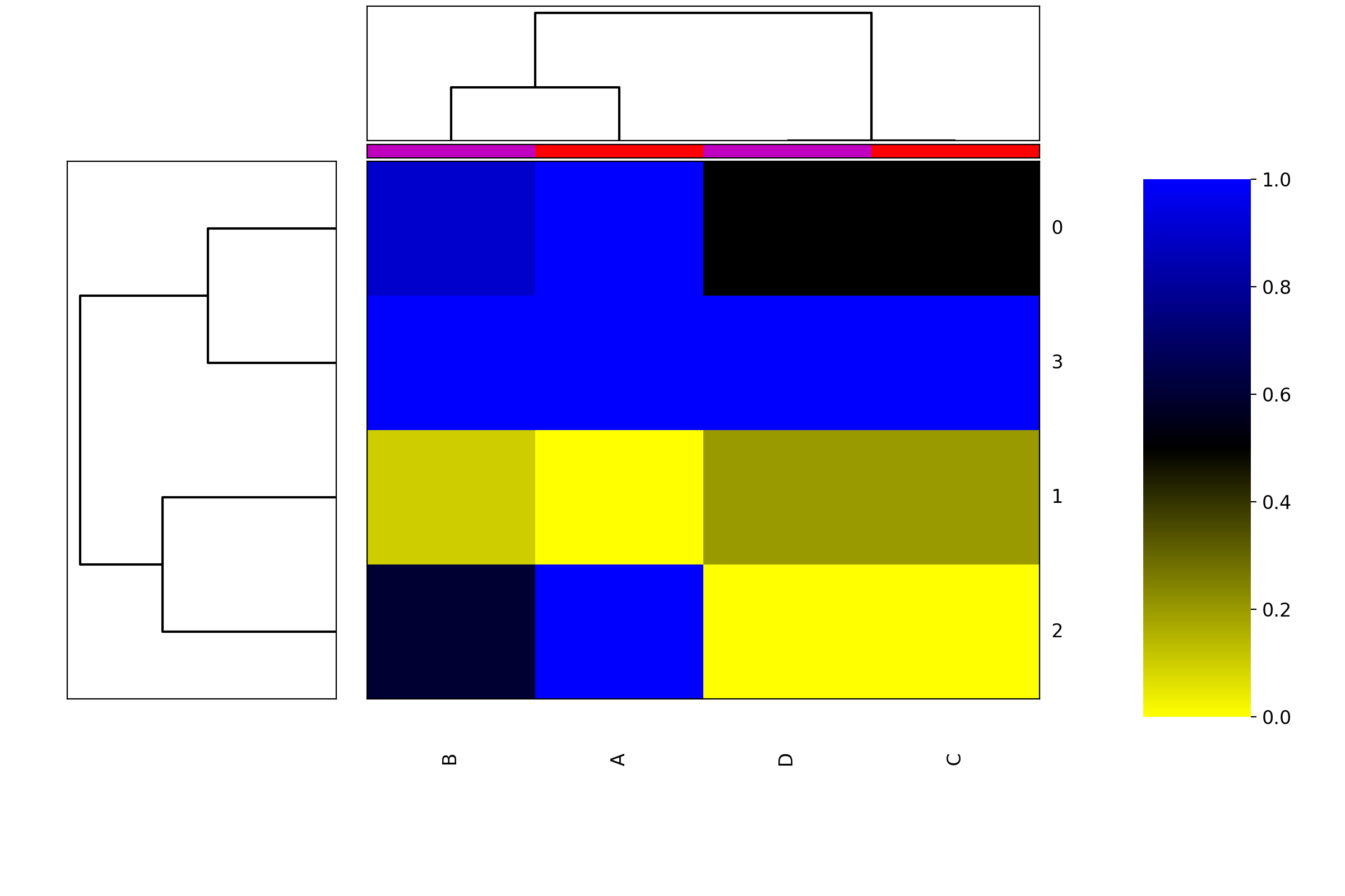
- class Heatmap(data=None, row_method='complete', column_method='complete', row_metric='euclidean', column_metric='euclidean', cmap='yellow_black_blue', col_side_colors=None, row_side_colors=None, verbose=True)[source]#
Heatmap and dendograms of an input matrix
A heat map is an image representation of a matrix with a dendrogram added to the left side and to the top. Typically, reordering of the rows and columns according to some set of values (row or column means) within the restrictions imposed by the dendrogram is carried out.
from sequana.viz import heatmap
df = heatmap.get_heatmap_df()
h = heatmap.Heatmap(df)
h.plot()
(
Source code,png,hires.png,pdf)
side colors can be added:
h = viz.Heatmap(df, col_side_colors=['r', 'g', 'b', 'y', 'k']); h.category_column = category; h.category_row = category
where category is a dictionary with keys as df.columns and values as category defined by you. The number of colors in col_side_colors and row_side_colors should match the number of category
constructor
- Parameters:
data -- a dataframe or possibly a numpy matrix.
row_method -- complete by default
column_method -- complete by default. See linkage module for details
row_metric -- euclidean by default
column_metric -- euclidean by default
cmap -- colormap. any matplotlib accepted or combo of colors as defined in colormap package (pypi)
col_side_colors
row_side_colors
- property column_method#
- property column_metric#
- property df#
- property frame#
- plot(num=1, cmap=None, colorbar=True, vmin=None, vmax=None, colorbar_position='right', gradient_span='None', figsize=(12, 8), fontsize=None)[source]#
Using as input:
df = pd.DataFrame({'A':[1,0,1,1],
                   'B':[.9,0.1,.6,1],
                'C':[.5,.2,0,1],
                'D':[.5,.2,0,1]})
we can plot the heatmap + dendogram as follows:
h = Heatmap(df)
h.plot(vmin=0, vmax=1.1)
from sequana.viz import heatmap
df = heatmap.get_heatmap_df()
h = heatmap.Heatmap(df)
h.category_column['A'] = 1
h.category_column['C'] = 1
h.category_column['D'] = 2
h.category_column['B'] = 2
h.plot()
(
Source code,png,hires.png,pdf)
- property row_method#
- property row_metric#
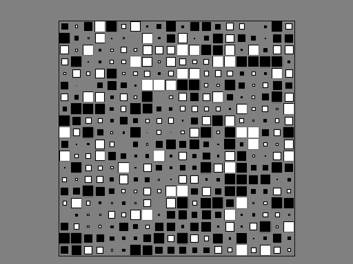
Hinton plot#
Hinton plot
- author:
Thomas Cokelaer
- hinton(df, fig=1, shrink=2, method='square', bgcolor='grey', cmap='gray_r', binarise_color=True)[source]#
Hinton plot (simplified version of correlation plot)
- Parameters:
df -- the input data as a dataframe or list of items (list, array). See
Corrplotfor details.fig -- in which figure to plot the data
shrink -- factor to increase/decrease sizes of the symbols
method -- set the type of symbols for each coordinates. (default to square). See
Corrplotfor more details.bgcolor -- set the background and label colors as grey
cmap -- gray color map used by default
binarise_color -- use only two colors. One for positive values and one for negative values.
import numpy as np
import pandas as pd
from sequana.viz.hinton import hinton
df = pd.DataFrame(np.random.rand(20, 20) - 0.5)
hinton(df)
(
Source code,png,hires.png,pdf)
Note
Idea taken from a matplotlib recipes http://matplotlib.org/examples/specialty_plots/hinton_demo.html but solely using the implementation within
CorrplotNote
Values must be between -1 and 1. No sanity check performed.
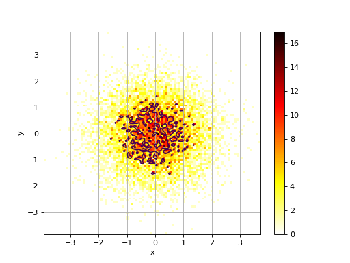
2D Histogram#
2D histograms
- class Hist2D(x, y=None, verbose=False)[source]#
2D histogram
from numpy import random
from sequana.viz import hist2d
X = random.randn(10000)
Y = random.randn(10000)
h = hist2d.Hist2D(X,Y)
h.plot(bins=100, contour=True)
(
Source code,png,hires.png,pdf)
constructor
- Parameters:
x -- an array for X values. See
VizInput2Dfor details.y -- an array for Y values. See
VizInput2Dfor details.
- plot(bins=100, cmap='hot_r', fontsize=10, Nlevels=4, xlabel=None, ylabel=None, norm=None, range=None, normed=False, colorbar=True, contour=True, grid=True, **kargs)[source]#
plots histogram of mean across replicates versus coefficient variation
- Parameters:
bins (int) -- binning for the 2D histogram (either a float or list of 2 binning values).
cmap -- a valid colormap (defaults to hot_r)
fontsize -- fontsize for the labels
Nlevels (int) -- must be more than 2
xlabel (str) -- set the xlabel (overwrites content of the dataframe)
ylabel (str) -- set the ylabel (overwrites content of the dataframe)
norm -- set to 'log' to show the log10 of the values.
normed -- normalise the data
range -- as in pylab.Hist2D : a 2x2 shape [[-3,3],[-4,4]]
contour -- show some contours (default to True)
grid (bool) -- Show unerlying grid (defaults to True)
If the input is a dataframe, the xlabel and ylabel will be populated with the column names of the dataframe.
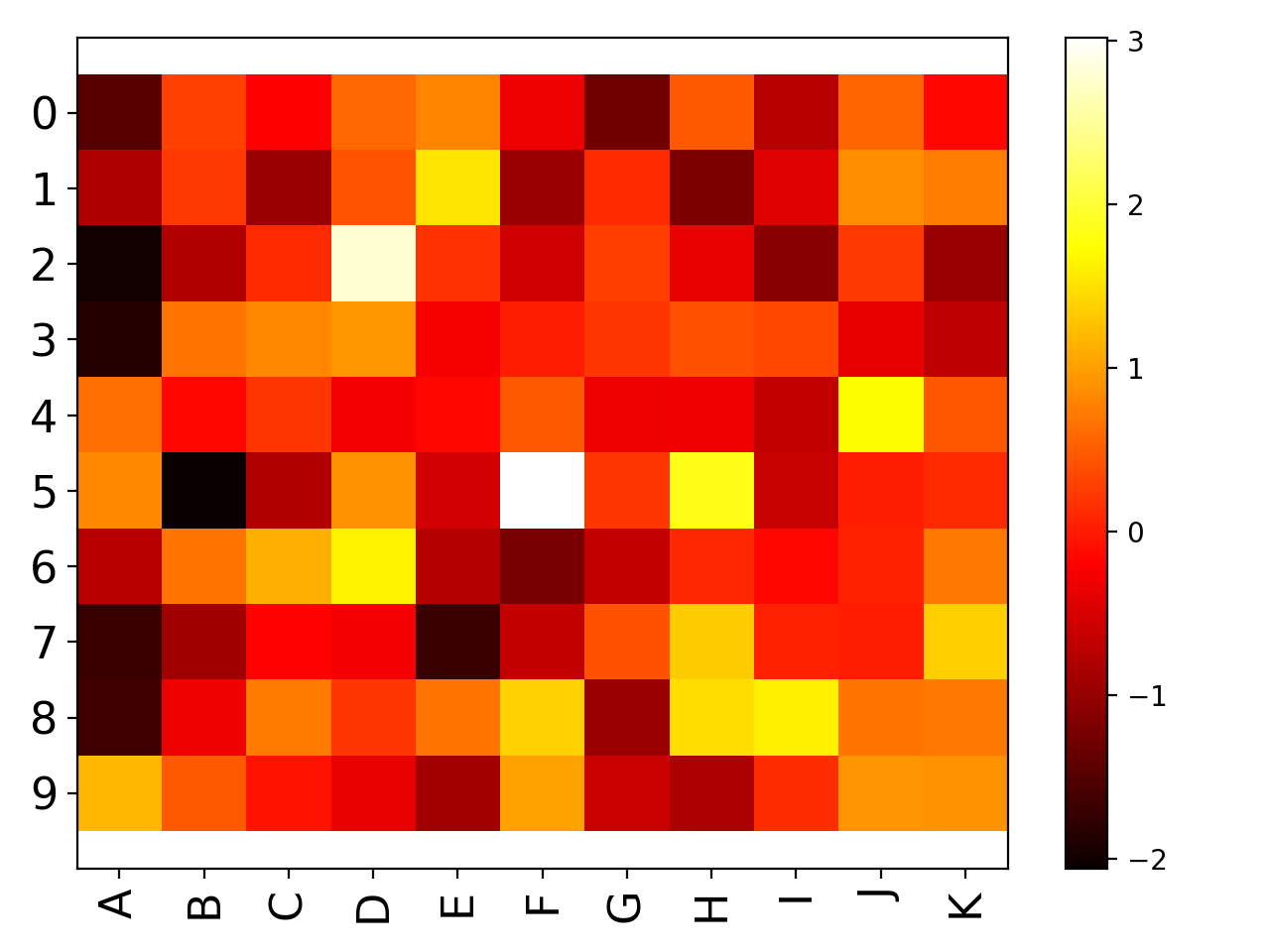
Image#
Imshow utility
- class Imshow(x, verbose=True)[source]#
Wrapper around the matplotlib.imshow function
Very similar to matplotlib but set interpolation to None, and aspect to automatic and accepts input as a dataframe, in whic case x and y labels are set automatically.
import pandas as pd
data = dict([ (letter,np.random.randn(10)) for letter in 'ABCDEFGHIJK'])
df = pd.DataFrame(data)

from sequana.viz import Imshow
im = Imshow(df)
im.plot()
(
Source code,png,hires.png,pdf)
constructor
- Parameters:
x -- input dataframe (or numpy matrix/array). Must be squared.
- plot(interpolation='None', aspect='auto', cmap='hot', tight_layout=True, colorbar=True, fontsize_x=None, fontsize_y=None, rotation_x=90, xticks_on=True, yticks_on=True, **kargs)[source]#
wrapper around imshow to plot a dataframe
- Parameters:
interpolation -- set to None
aspect -- set to 'auto'
cmap -- colormap to be used.
tight_layout
colorbar -- add a colobar (default to True)
fontsize_x -- fontsize on xlabels
fontsize_y -- fontsize on ylabels
rotation_x -- rotate labels on xaxis
xticks_on -- switch off the xticks and labels
yticks_on -- switch off the yticks and labels
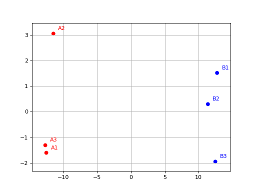
PCA#
- class PCA(data, colors={})[source]#
from sequana.viz.pca import PCA
from sequana import sequana_data
import pandas as pd

data = sequana_data("test_pca.csv")
df = pd.read_csv(data)
df = df.set_index("Id")
p = PCA(df, colors={
    "A1": 'r', "A2": 'r', 'A3': 'r',
    "B1": 'b', "B2": 'b', 'B3': 'b'})
p.plot(n_components=2)
(
Source code,png,hires.png,pdf)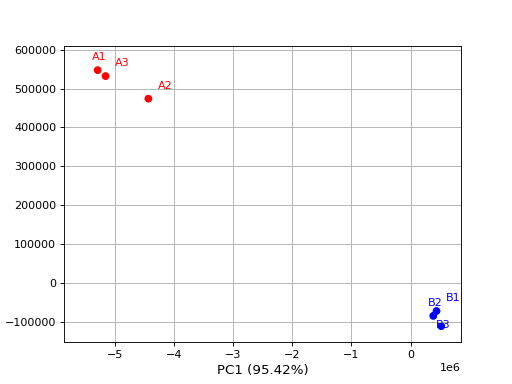
From R, a PCA is selecting the first 500 features based on variance.
constructor
- Parameters:
data -- a dataframe; Each column being a sample.
colors -- a mapping of column/sample name a color
- plot(n_components=2, transform='log', switch_x=False, switch_y=False, switch_z=False, colors=None, max_features=500, show_plot=True, fontsize=10, adjust=True)[source]#
- Parameters:
n_components -- at number starting at 2 or a value below 1 e.g. 0.95 means select automatically the number of components to capture 95% of the variance
transform -- can be 'log' or 'anscombe', log is just log10. count with zeros, are set to 1
- plot_pca_vs_max_features(step=100, n_components=2, transform='log')[source]#
from sequana.viz.pca import PCA
from sequana import sequana_data
import pandas as pd

data = sequana_data("test_pca.csv")
df = pd.read_csv(data)
df = df.set_index("Id")

p = PCA(df)
p.plot_pca_vs_max_features()
(
Source code,png,hires.png,pdf)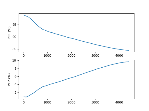
ScatterPlot#
Scatter plots
- author:
Thomas Cokelaer
- class ScatterHist(x, y=None, verbose=True)[source]#
Scatter plots and histograms
constructor
- Parameters:
x -- if x is provided, it should be a dataframe with 2 columns. The first one will be used as your X data, and the second one as the Y data
y
verbose
- plot(kargs_scatter={'c': 'b', 's': 20}, kargs_grids={}, kargs_histx={}, kargs_histy={}, scatter_position='bottom left', width=0.5, height=0.5, offset_x=0.1, offset_y=0.1, gap=0.06, facecolor='lightgrey', grid=True, show_labels=True, **kargs)[source]#
Scatter plot of set of 2 vectors and their histograms.
- Parameters:
x -- a dataframe or a numpy matrix (2 vectors) or a list of 2 items, which can be a mix of list or numpy array. if size and/or color are found in the columns dataframe, those columns will be used in the scatter plot. kargs_scatter keys c and s will then be ignored. If a list of lists, x will be the first row and y the second row.
y -- if x is a list or an array, then y must also be provided as a list or an array
kargs_scatter -- a dictionary with pairs of key/value accepted by matplotlib.scatter function. Examples is a list of colors or a list of sizes as shown in the examples below.
kargs_grid -- a dictionary with pairs of key/value accepted by the maplotlib.grid (applied on histogram and axis at the same time)
kargs_histx -- a dictionary with pairs of key/value accepted by the matplotlib.histogram
kargs_histy -- a dictionary with pairs of key/value accepted by the matplotlib.histogram
kargs -- other optional parameters are hold, facecolor.
scatter_position -- can be 'bottom right/bottom left/top left/top right'
width -- width of the scatter plot (value between 0 and 1)
height -- height of the scatter plot (value between 0 and 1)
offset_x
offset_y
gap -- gap between the scatter and histogram plots.
grid -- defaults to True
- Returns:
the scatter, histogram1 and histogram2 axes.
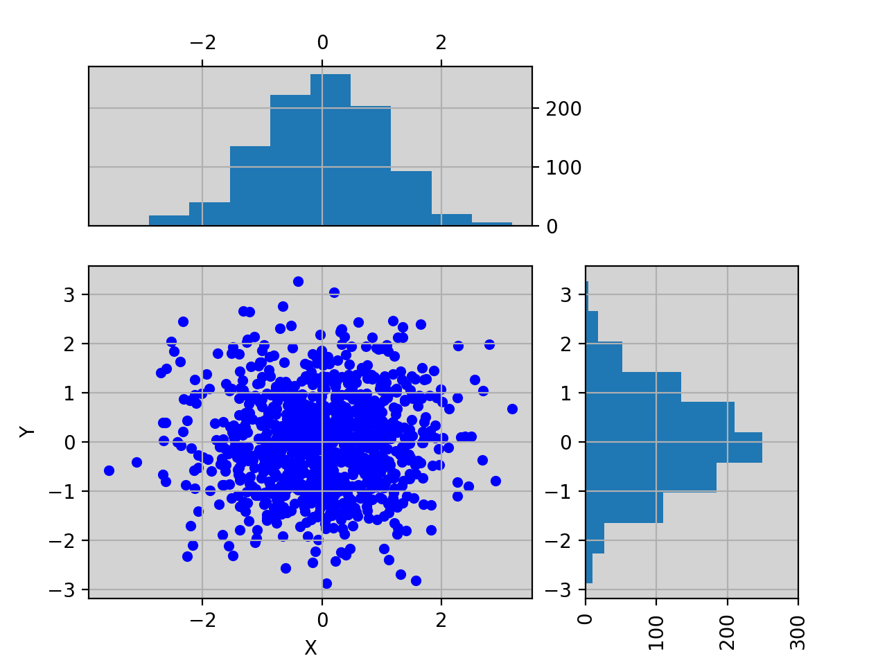
import pylab
import pandas as pd
X = pylab.randn(1000)
Y = pylab.randn(1000)
df = pd.DataFrame({'X':X, 'Y':Y})

from sequana.viz import ScatterHist
ScatterHist(df).plot()
(
Source code,png,hires.png,pdf)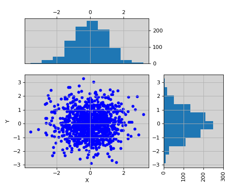
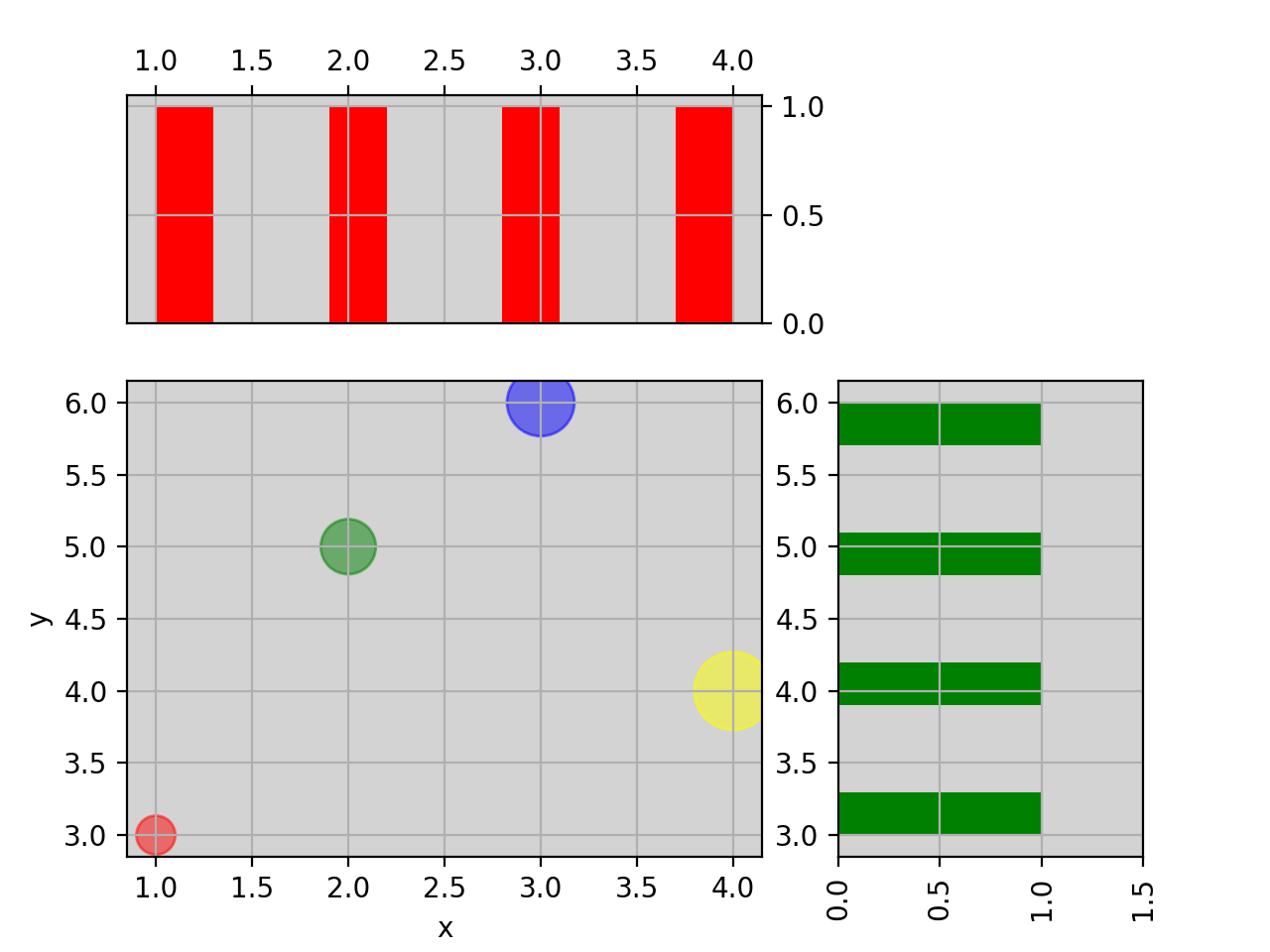
from sequana.viz import ScatterHist
ScatterHist(x=[1,2,3,4], y=[3,5,6,4]).plot(
    kargs_scatter={
        's':[200,400,600,800],
        'c': ['red', 'green', 'blue', 'yellow'],
        'alpha':0.5},
    kargs_histx={'color': 'red'},
    kargs_histy={'color': 'green'})
(
Source code,png,hires.png,pdf)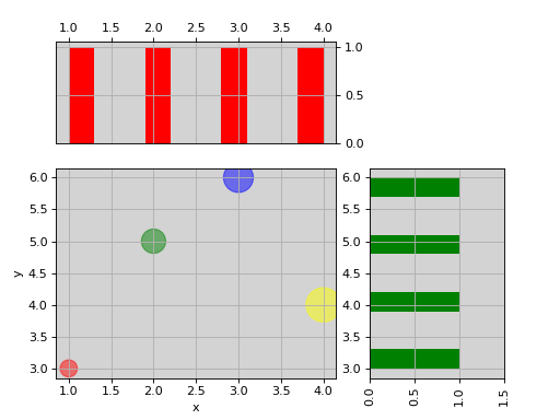
See also
Venn diagram#
- plot_venn(subsets, labels=None, title=None, ax=None, alpha=0.8, weighted=False, colors=('r', 'b', 'y'))[source]#
Plot venn diagramm according to number of groups.
- Parameters:
subsets -- This parameter may be (1) a dict, providing sizes of three diagram regions. The regions are identified via two-letter binary codes ('10', '01', and '11'), hence a valid set could look like: {'10': 10, '01': 20, '11': 40}. Unmentioned codes are considered to map to 0. (2) a list (or a tuple) with three numbers, denoting the sizes of the regions in the following order: (10, 01, 11) and (3) a list containing the subsets of values.
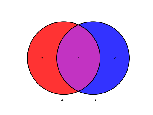
The subsets can be a list (or a tuple) containing two set objects. For instance:
from sequana.viz.venn import plot_venn
A = set([1,2,3,4,5,6,7,8,9])
B = set([            7,8,9,10,11])
plot_venn((A, B), labels=("A", "B"))
(
Source code,png,hires.png,pdf)
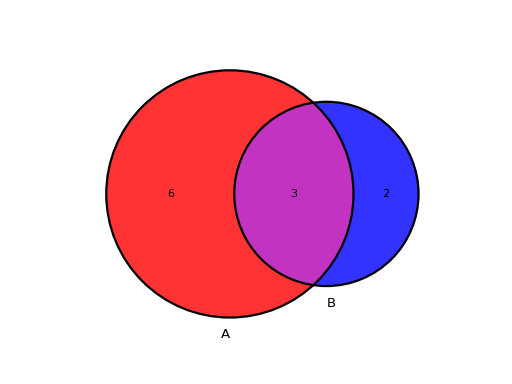
This is the unweighted version by default meaning all circles have the same size. If you prefer to have circle scaled to the size of the sets, add the relevant parameter as follows:
from sequana.viz.venn import plot_venn
A = set([1,2,3,4,5,6,7,8,9])
B = set([            7,8,9,10,11])
plot_venn((A, B), labels=("A", "B"), weighted=True)
(
Source code,png,hires.png,pdf)
Similarly for 3 sets, a Venn diagram can be represented as follows. Note here that we also use the title parameter:
from sequana.viz.venn import plot_venn

A = set([1,2,3,4,5,6,7,8,9])
B = set([      4,5,6,7,8,9,10,11,12,13])
C = set([   3,4,5,6,7,8,9])
plot_venn((A, B, C), labels=("A", "B", "C"), title="my Venn3 diagram")
(
Source code,png,hires.png,pdf)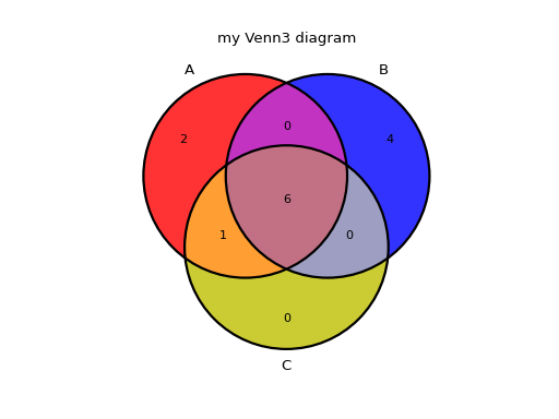
Input can be a list/tuple of 2 or 3 sets as described above.
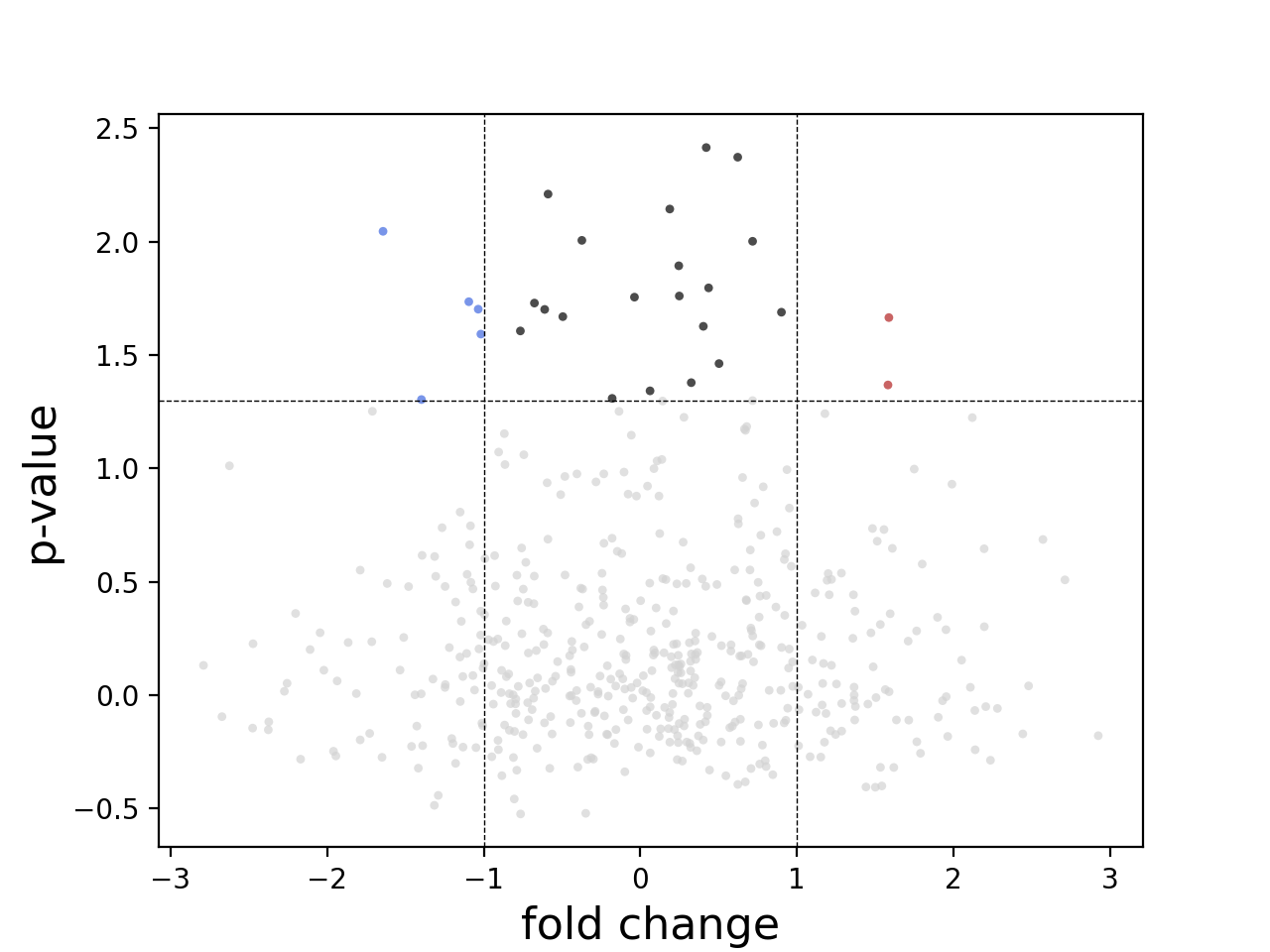
Volcano plots#
Volcano plot
- class Volcano(data=None, log2fc_col='log2FoldChange', pvalues_col='padj', annot_col='', color='auto', pvalue_threshold=np.float64(1.3010299956639813), log2fc_threshold=1)[source]#
Volcano plot
In essence, just a scatter plot with annotations.
import numpy as np
fc = np.random.randn(1000)
pvalue = np.random.randn(1000)
import pandas as pd
data = pd.DataFrame([fc, pvalue])
data = data.T
data.columns = ['log2FoldChange', 'padj']

from sequana.viz import Volcano
v = Volcano(data)
v.plot()
(
Source code,png,hires.png,pdf)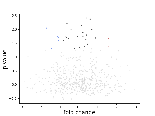
constructor
- Parameters:
data (DataFrame) -- Pandas DataFrame with rnadiff results.
log2fc_col -- Name of the column with log2 Fold changes.
pvalues_col -- Name of the column with adjusted pvalues.
annot_col -- Name of the column with genes names for plot annotation.
color -- for color choice
pvalue_threshold -- Adjusted pvalue threshold to use for coloring/annotation.
log2fc_threshold -- Log2 Fold Change threshold to use for coloring/annotation.
- plot(size=10, alpha=0.7, marker='o', fontsize=16, xlabel='fold change', logy=False, threshold_lines={'color': 'black', 'ls': '--', 'width': 0.5}, ylabel='p-value', add_broken_axes=False, broken_axes={'ylims': ((0, 10), (50, 100))})[source]#
- Parameters:
size -- size of the markers
alpha -- transparency of the marker
fontsize
xlabel
ylabel
center -- If centering the x axis
Generic plots (plotly)#
- class BinaryPercentage[source]#
Expects a dataframe with 2 columns. Their names are used for the labels. Indices of the dataframe is the sample name.
import pandas as pd
from sequana.viz.plotly import BinaryPercentage
hb = BinaryPercentage()
hb.df = pd.DataFrame({"A": [1,50,100], 'B': [1,50,100]})
fig = hb.plot_horizontal_bar(html_code=True)
fig.show()

Bar plot#
Boxplot#
Clustering#
- class Cluster(data, colors={})[source]#
Input must be a matrix in the form of a pandas DataFrame. Each column is a sample. Sample names are the columns' names. colors are set to red for all samples but user can provide a mapping of columns' names and a color.
c = Cluster(data, colors={"A": "r", "B": "g"}
constructor
- Parameters:
data -- a dataframe; Each column being a sample.
colors -- a mapping of column/sample name a color
Core#
Core function for the plotting tools
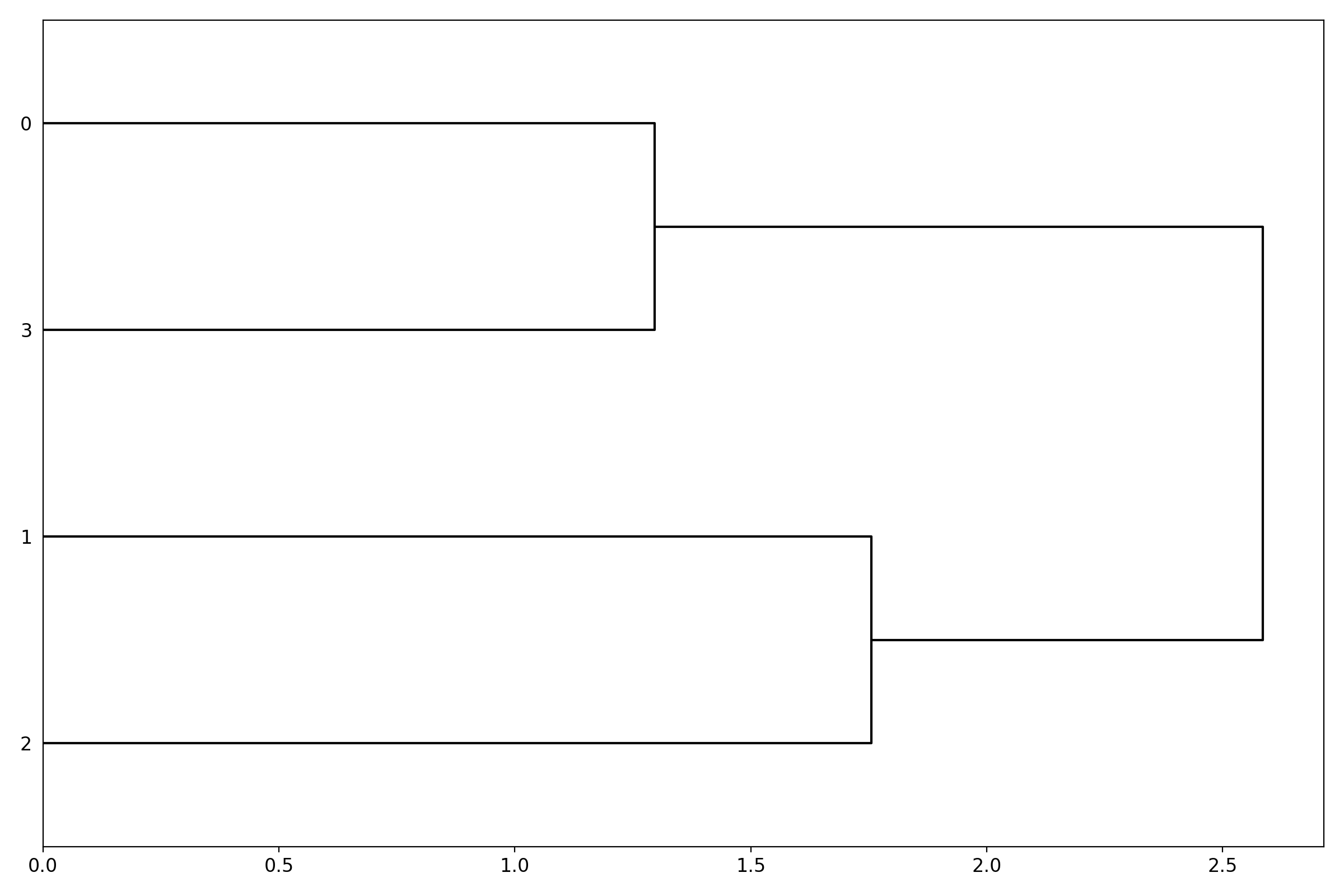
Dendrogram#
Heatmap and dendograms
- class Dendogram(data=None, method='complete', metric='euclidean', cmap='yellow_black_blue', col_side_colors=None, side_colors=None, verbose=True, horizontal=True)[source]#
dendograms of an input matrix
from sequana.viz import heatmap, dendogram
df = heatmap.get_heatmap_df()
h = dendogram.Dendogram(df)
h.plot()
(
Source code,png,hires.png,pdf)
You should scale the data before:
from sequana.viz.clusterisation import Clusterisation
scaled, index = Clusterisation(data).scale_data()
import pandas as pd
df = pd.DataFrame(scaled)
df.index = index
df.columns = data.columns

g = Dendogram(df.T)
g.plot()
constructor
- Parameters:
data -- a dataframe or possibly a numpy matrix.
method -- complete by default
metric -- euclidean by default
cmap -- colormap. any matplotlib accepted or combo of colors as defined in colormap package (pypi)
col_side_colors
side_colors
- property df#
- property frame#
- property method#
- property metric#
- plot(num=1, cmap=None, colorbar=True, figsize=(12, 8), fontsize=None)[source]#
Render the dendogram of the input matrix.
Using as input:
df = pd.DataFrame({'A':[1,0,1,1],
                   'B':[.9,0.1,.6,1],
                   'C':[.5,.2,0,1],
                   'D':[.5,.2,0,1]})
from sequana.viz import heatmap, dendogram
df = heatmap.get_heatmap_df()
d = dendogram.Dendogram(df)
d.plot()
(
Source code,png,hires.png,pdf)
Dotplot#
Ideogram#
- class Ideogram(df, gaps={})[source]#
from sequana import FastA f = FastA("assembly.fa") N = len(f) L = [ f.get_lengths_as_dict()[str(x)] for x in range(1,N+1)]
# import pandas as pd centromeres = pd.read_csv("centromeres.csv", sep=",") C = [centromeres.query('chrom==@x')['hic_position'].values[0] for x in range(1,N+1)]
telomeres = pd.read_csv("telomeres//sequana.telomark.telomark.csv") X1 = telomeres['5to3_LHS_position'].values X2 = telomeres['3to5_RHS_position'].values X2 = L - X2
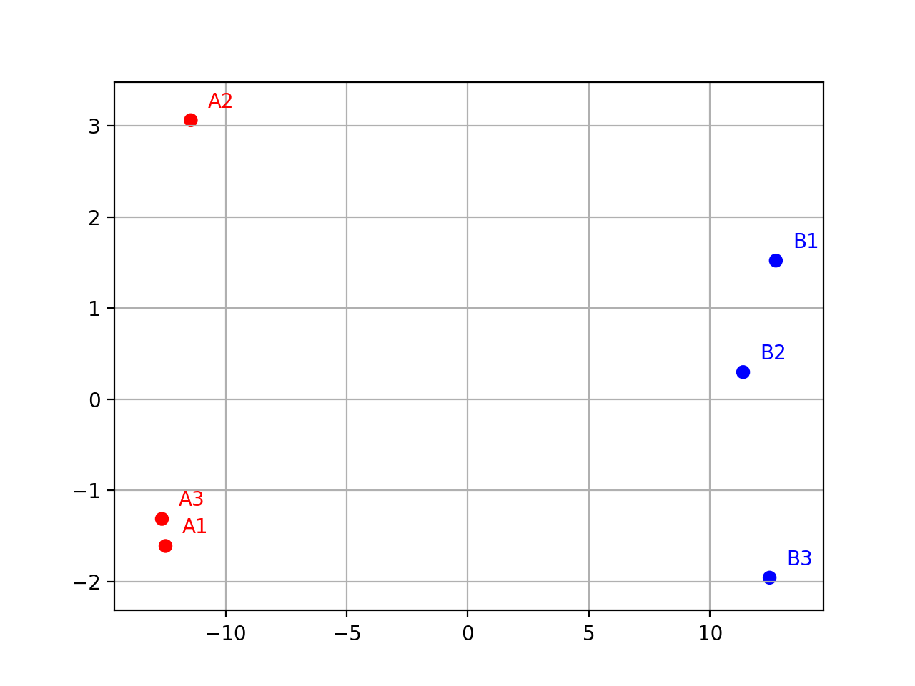
Isomap#
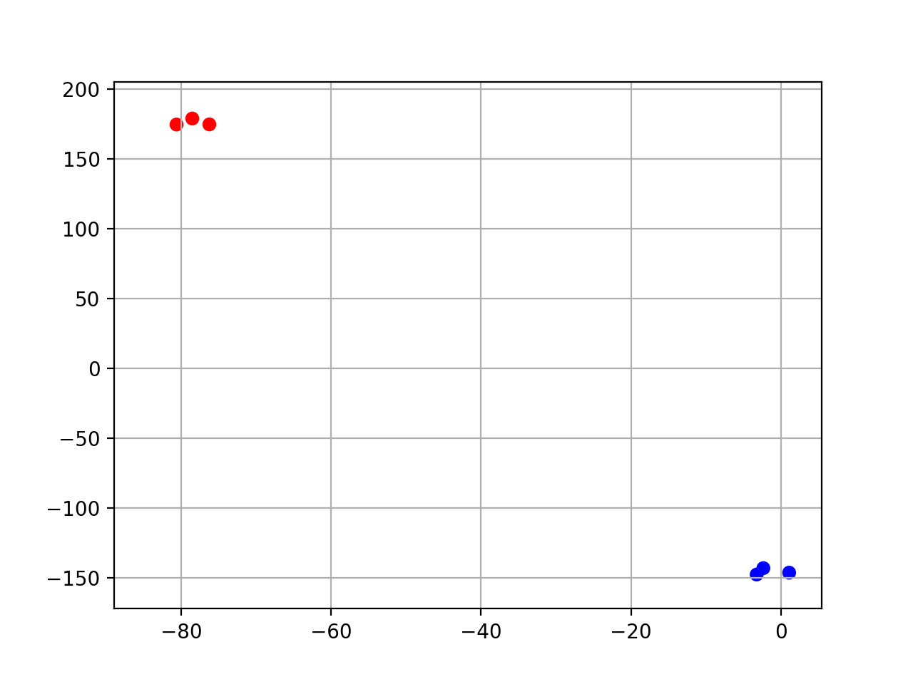
- class Isomap(data, colors={})[source]#
Isomap (non-linear dimensionality reduction) wrapper.
from sequana.viz.isomap import Isomap
from sequana import sequana_data
import pandas as pd

data = sequana_data("test_pca.csv")
df = pd.read_csv(data)
df = df.set_index("Id")
p = Isomap(df, colors={
    "A1": 'r', "A2": 'r', 'A3': 'r',
    "B1": 'b', "B2": 'b', 'B3': 'b'})
p.plot(n_components=2)
(
Source code,png,hires.png,pdf)
constructor
- Parameters:
data -- a dataframe; Each column being a sample.
colors -- a mapping of column/sample name a color
- plot(n_components=2, n_neighbors=5, transform='log', switch_x=False, switch_y=False, switch_z=False, colors=None, max_features=500, show_plot=True)[source]#
- Parameters:
n_components -- at number starting at 2 or a value below 1 e.g. 0.95 means select automatically the number of components to capture 95% of the variance
transform -- can be 'log' or 'anscombe', log is just log10. count with zeros, are set to 1
Linkage#
Heatmap and dendograms
- class Linkage[source]#
Linkage used in other tools such as Heatmap
constructor
- Parameters:
data -- a dataframe or possibly a numpy matrix.
- methods = ['single', 'complete', 'average', 'weighted', 'centroid', 'median', 'ward']#
- metrics = ['braycurtis', 'canberra', 'chebyshev', 'cityblock', 'correlation', 'cosine', 'dice', 'euclidean', 'hamming', 'jaccard', 'jensenshannon', 'kulsinski', 'mahalanobis', 'matching', 'minkowski', 'rogerstanimoto', 'russellrao', 'seuclidean', 'sokalmichener', 'sokalsneath', 'sqeuclidean', 'yule']#
MDS#
t-SNE#
- class TSNE(data, colors={})[source]#
t-SNE non-linear dimensionality reduction wrapper.
from sequana.viz.tsne import TSNE
from sequana import sequana_data
import pandas as pd

data = sequana_data("test_pca.csv")
df = pd.read_csv(data)
df = df.set_index("Id")
p = TSNE(df, colors={
    "A1": 'r', "A2": 'r', 'A3': 'r',
    "B1": 'b', "B2": 'b', 'B3': 'b'})
p.plot(perplexity=2)
(
Source code,png,hires.png,pdf)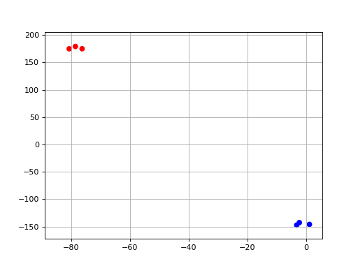
constructor
- Parameters:
data -- a dataframe; Each column being a sample.
colors -- a mapping of column/sample name a color
- plot(n_components=2, perplexity=30, n_iter=1000, init='random', random_state=0, transform='log', switch_x=False, switch_y=False, switch_z=False, colors=None, max_features=500, show_plot=True, show_labels=False)[source]#
- Parameters:
n_components -- at number starting at 2 or a value below 1 e.g. 0.95 means select automatically the number of components to capture 95% of the variance
transform -- can be 'log' or 'anscombe', log is just log10. count with zeros, are set to 1